Making the assets
by Carolina Romano
In the game there are different ways of seeing the world. Each way of seeing it has it's own aesthetics.
Here are some references I had to create two of the views:
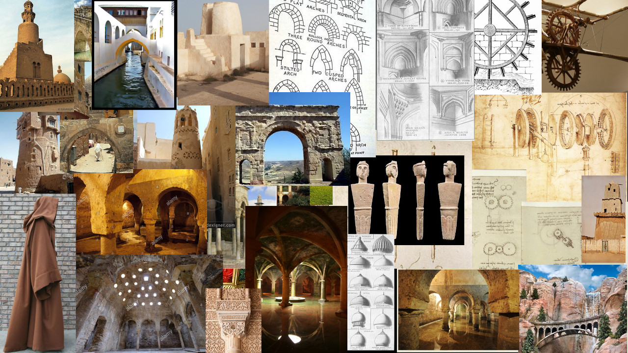
One of the views is based on Arabic architecture and aesthetics. The one composed of the orange and green colors.
The first inspiration to the world was an aljibe. Then it became a broader understanding of this.
In this panel I have compiled several references I had for different assets of this view in the game, to give you a general idea.
This second view is inspired in the Art Deco aesthetics, and also some times Art Nouveau. This view is composed of the green and yellow colors. As in the previous pannel, I have compiled a lot of references for different assets, just to give you a general idea.
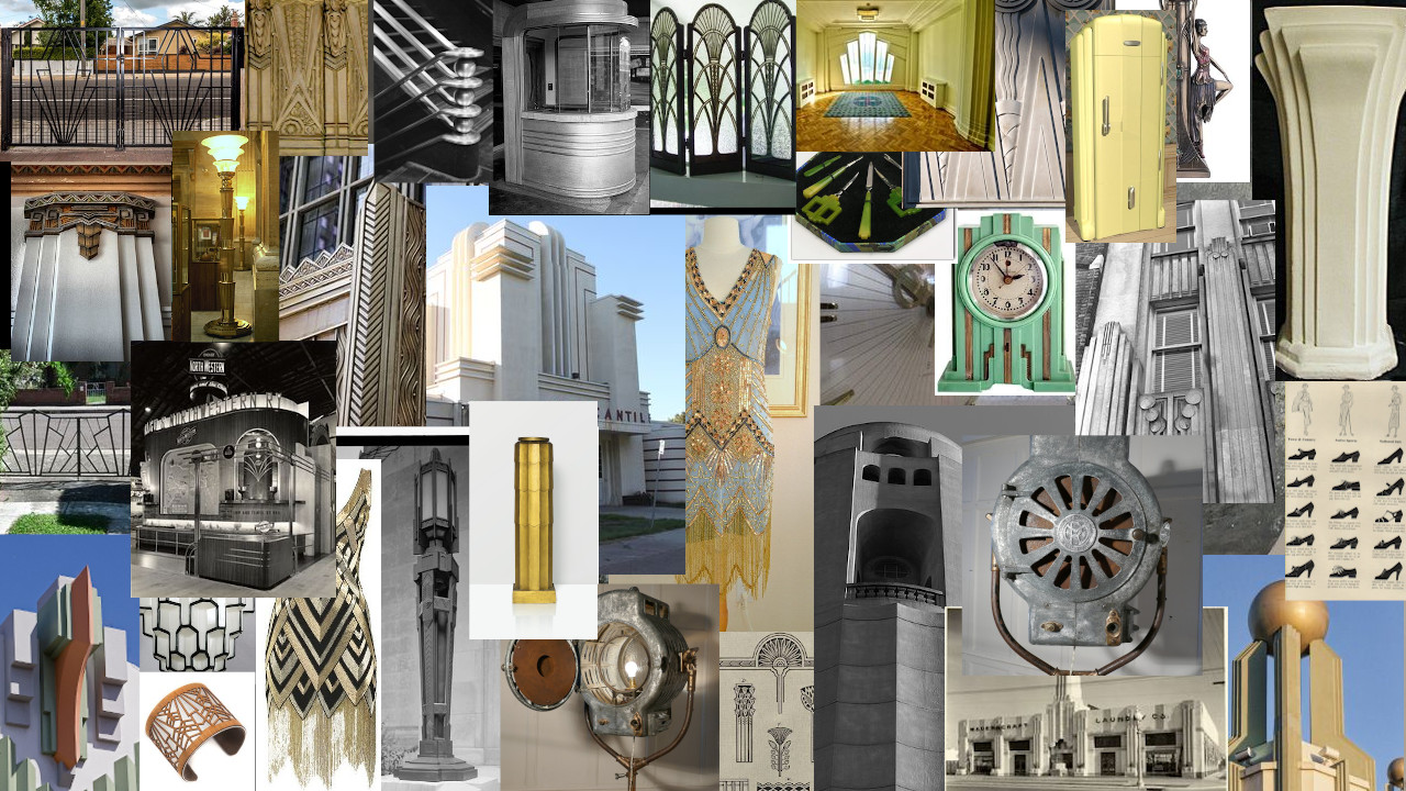
I will not put reference for the other combination of colors, because it would be a spoiler.
So, to create the assets of NAMAVE we had the following key constrains:
- Each view has specific aesthetics.
- Each view is composed by two colors.
- Each view shares one color with the other views.
To design them, I had to take into consideration which color should be above and below which other, in order to make the style for each world still work while sharing elements from one world to another.
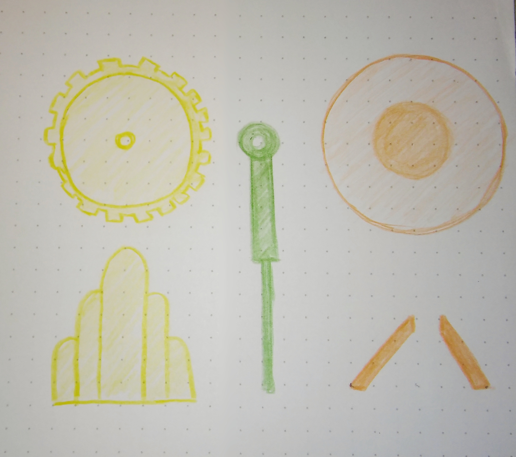
Here you can see the sketches I've done, before of creating the asset of the wheel. This one should have the inner machinery visible in one of the views but not in the others.
So in order for this to work, the idea is that the most specific piece, for example the most "art deco-ish" design, will have to be hidden in the view with Arabic aesthetics.
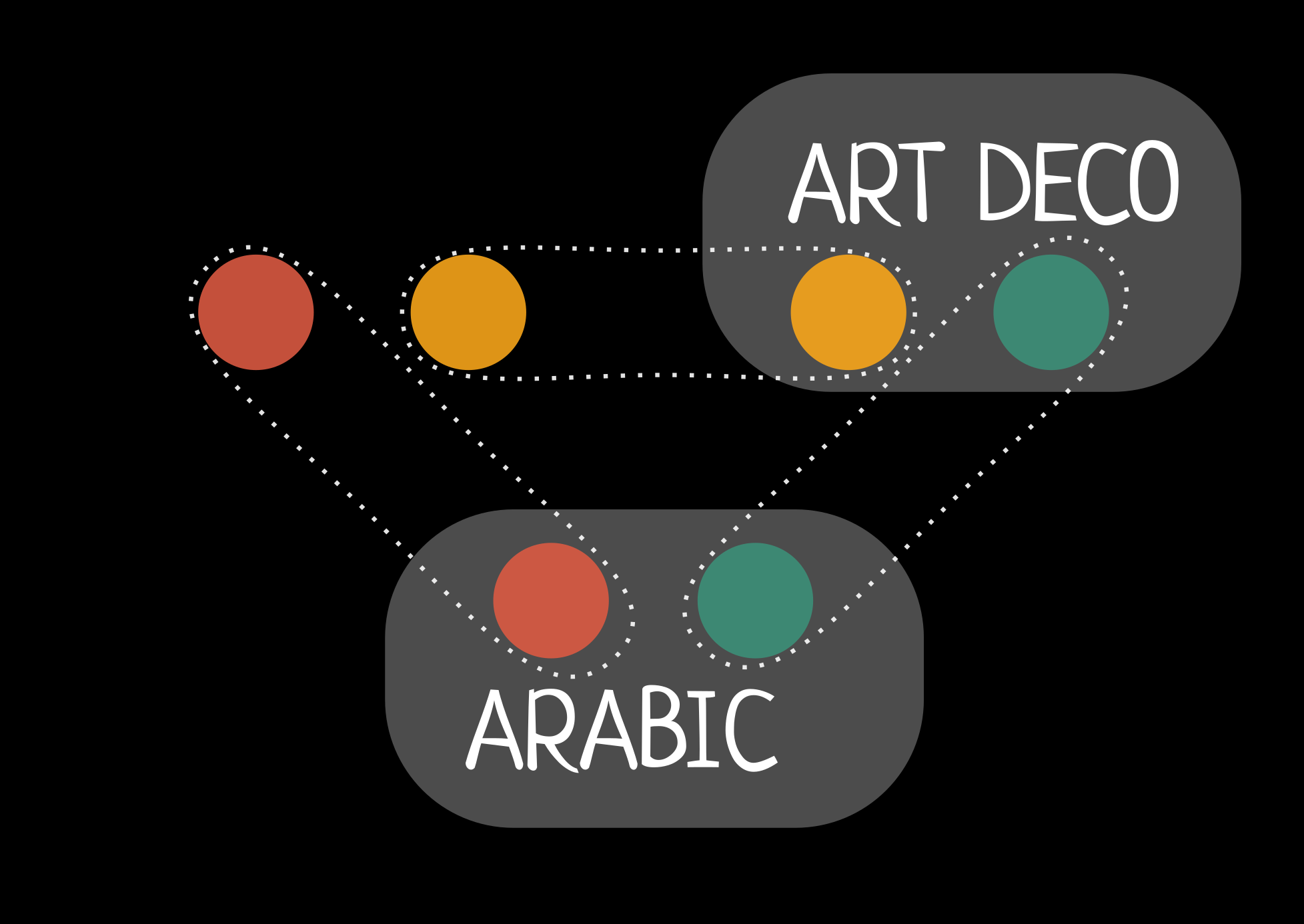
This process is a little bit hard, and you can understand this better if you take into consideration that most assets are composed of three aestetics. Several times I had to start from scratch. This happened when I realized some of the parts was not matching the whole structure. But with time it became intuitive.
Here you can see how this asset was solved at the end:
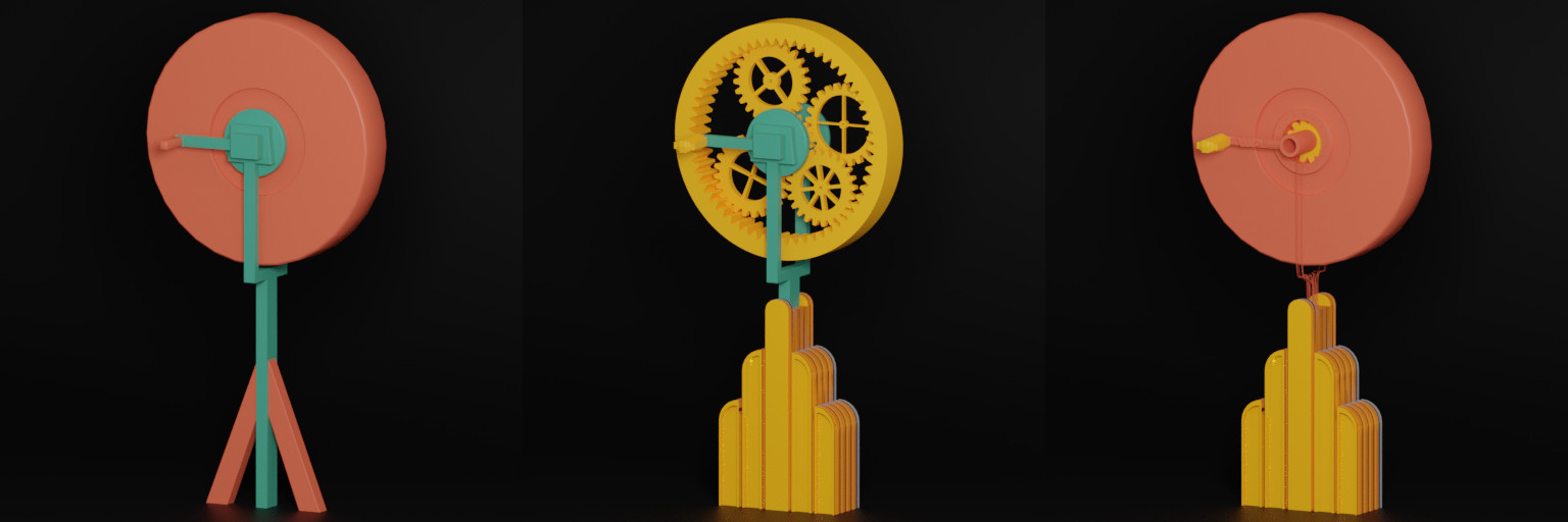
In this case the wheel stand (green) is shared between the Arabic and Art Deco views. The yellow lower part (Art Deco) hides the red lower part (Arabic). The red upper part (Arabic) covers yellow upper part (Art Deco).
Making the assets
by Carolina Romano
In the game there are different ways of seeing the world. Each way of seeing it has it's own aesthetics.
Here are some references I had to create two of the views:
One of the views is based on Arabic architecture and aesthetics. The one composed of the orange and green colors.
The first inspiration to the world was an aljibe. Then it became a broader understanding of this.
In this panel I have compiled several references I had for different assets of this view in the game, to give you a general idea.

This second view is inspired in the Art Deco aesthetics, and also some times Art Nouveau. This view is composed of the green and yellow colors. As in the previous pannel, I have compiled a lot of references for different assets, just to give you a general idea.

I will not put reference for the other combination of colors, because it would be a spoiler.
So, to create the assets of NAMAVE we had the following key constrains:
- Each view has specific aesthetics.
- Each view is composed by two colors.
- Each view shares one color with the other views.
To design them, I had to take into consideration which color should be above and below which other, in order to make the style for each world still work while sharing elements from one world to another.

Here you can see the sketches I've done, before of creating the asset of the wheel. This one should have the inner machinery visible in one of the views but not in the others.
So in order for this to work, the idea is that the most specific piece, for example the most "art deco-ish" design, will have to be hidden in the view with Arabic aesthetics.

This process is a little bit hard, and you can understand this better if you take into consideration that most assets are composed of three aestetics. Several times I had to start from scratch. This happened when I realized some of the parts was not matching the whole structure. But with time it became intuitive.
Here you can see how this asset was solved at the end:

In this case the wheel stand (green) is shared between the Arabic and Art Deco views. The yellow lower part (Art Deco) hides the red lower part (Arabic). The red upper part (Arabic) covers yellow upper part (Art Deco).